Thursday, October 6, 2022

Anatomy, Aircraft, and Aves.

 Learning Anatomy

In the past few years, I have been trying to develop my skill in the area of figurative drawing and painting. A few copies of great masters’ portraits and efforts of my own were the starting point. I then attended classes of drawing figures that cumulated in coaching by Paul Birchall. The work with Paul took me to another level where I could draw figures from my imagination. The results were OK but can be improved.

A am a friend of an artist, Charlotte Firbank-King, who produces the most fantastic images straight from her imagination. In her paintings people and animals abound in all sorts of natural settings. Er ability to create and most amazing detail in a scene is astounding. One day Charlotte said to me that to improve my figurative and portrait work I would benefit from the study of anatomy.

I have a collection of books on anatomy and figure drawing for artists. I began a process of study following an idea put forward by Loomis in his book ‘Figure Drawing for all its worth’. Loomis suggests taking a diagram showing the various muscles and identify them from suitable sources.

My process begins by selecting a figure from a book on human anatomy published by 3dtotal publishing. They present a photograph of a model and superimposed on the image are the muscles, tendons and bones visible from the surface. I produce a drawing of the image on A3 layout paper (60gsm) and then refer to my various books to attach labels to the various muscles depicted.

So far, I have created two diagrams through this process. I spend about three days to create a diagram. I work for a few hours and then retire to other activity so that the learning points can sink in. Most of what is depicted remains on the drawing not in my head but I am counting on repetition and practice to address that problem. The diagrams below are where this style of work has reached so far.


Muscles of the arm and body from the back


Muscles of the body from the front


Aeroplanes

Following the drawing of the Hawker Hart that I describe in a previous post on this blog I repeated the process to create a drawing of an American Biplane, a Boening Stearman. The aircraft was used to train naval aviators in the 1930s and 1940s.


Boeing Stearman

Bird photography

One of my hobbies is photography, with mixed results I spend quite a bit of time trying to photograph birds. I recently had the opportunity to photograph a Turaco, locally known as a Knysna Lourie. The bird has striking red wings that are only visible when it flies. Because it lives in forests the main way of getting about for this bird is to hop along branches and then swiftly leap and fly to the next tree. This presents a challenge for the photographer, getting the bird in the frame, focusing, then capturing the backlit image.

My own attempts were not particularly successful. However, there was sufficient detail in the image to be able to create a drawing of the bird and then add colour using coloured pencil. I drew the image on A3 layout paper (60gsm) using Lyra pencils, then added colour using Lyra coloured pencils. The result is presented below. 

Knysna Lourie - pencil drawing with colourd pencil 'wash' over


Monday, August 1, 2022

Hawker Hart drawing

 I have a collection of 1:72 scale model aircraft that I have built up over many years. One of these is an Airfix kit I built whilst still at school a very long time ago. The aircraft in question is a biplane built by Hawker in the 1930s and sold to numerous air forces around the world. This particular version is called a Hawker Hart and was operated by the RAF up until the second world war.

Greyscale photograph of Airfix 1:72 scale model

Greyscale photograph selected for the drawing

 My process started by posing and taking a few photographs of the model and from that selection chose one to develop a pencil drawing from. I loaded the photograph into Microsoft PowerPoint and superimposed a grid pattern over it. Then I saved the resulting image as a jpg file which I could load and display in my Samsung Tablet.

Greyscale image with drawing grid superimposed
 

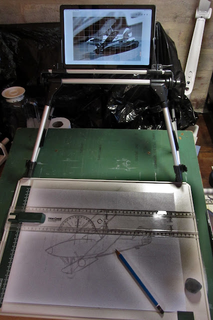
I decided to produce a work on A3 format paper. I loaded a sheet of 60 gsm sketching paper onto a suitable drawing board. In the past to reproduce images using this grid system, I used to draw the grid on the paper first which was a tedious process. With this drawing board I can shift the ruler around and draw or extend lines as needed. I this example each grid line worked out to be 3cm apart to give an image that fitted well in the A3 format. 

Set up to copy the photograph onto an A3 paper sheet

 I use a variety of drawing instruments including a roller rule to keep lines parallel with the structure of the centreline of the aircraft in place, and dividers to ensure that things that are supposed to converge or get smaller with vanishing points do in fact consistently do this. The set square is so I can quickly extend or re draw the vertical grid lines on the paper.

Picture showing some of the drawing instruments used

For most of the process my focus is on structural elements of the aircraft, I used an H2 pencil and putty rubber, to get the various lines in place. Curves and circles are the hardest because of the angle of the aircraft or the particular curves used by the original aircraft designer. Once that process was complete I worked over the drawing with a high carbon B2 Staedtler Mars Lumograph pencil to obtain a dark line that would be visible on a light table or light box.

Image showing use of high carbon pencils to obtain final line drawing

I traced the line drawing from the 60 gsm paper onto a sheet of 200gsm Ashrad sketch paper by placing the new paper over the original on a light box. Once I had captured the line drawing, I very gently shaded the background areas of the image. I started shading with a B4 pencil and progressively strengthened it by moving to B5 and then B6. I shaded by holding the pencil by its top end, farthest from the point as possible, with two fingers. Then I shaded by letting the weight of the pencil do the work, I just brushed it back and forth to cover the paper, the pencil as at a very flat angle for this process to work. I did not worry about over-running onto the aircraft image because I could lift these marks out easily with the putty rubber, the lack of weight means there is no indentation to worry about.

Once I had a light grey tone in the background and a horizon line defined, I tilted it a bit to create a bit of dynamic action on top of the diving attitude of the aircraft, I began shading the aircraft itself. As I went along it became apparent that the background needed to be darker to show up some of the highlights on the aircraft, I returned to shading background areas several times as the drawing progressed, and each time used the putty rubber to recover the highlight areas.

To differentiate the sky from the ground I first rubbed graphite flakes into the paper with tissue, and then worked over it with the pencils as described above. By this time I was shading background areas with very soft pencils up to B9.

The aircraft drawing proceeded by starting with a Lyra B4 pencil and re-working the image progressively with softer pencils up to B9. During this process I refined various curves and circles as best I could to arrive at the final image below.

The completed drawing - a Hawker Hart in flight


Tuesday, July 19, 2022

A new start

A month of disruption has gone by, we moved house from Cape Town to George. The move entailed considerable disruption because we had to put belongings into storage and make the house we were living in ‘saleable’. That is all behind us and we have since then been unpacking – four weeks of unpacking. At last, I have a semblance of order in my art life if nowhere else!

The new house offers a larger workspace, I now have a dedicated art studio to work in any time I like. Here is a photograph of the workspace I am now lucky enough to have to myself. 


An aside.

I am reading a small paperback book by Marcus du Sautoy entitled ‘The creativity code’. The book is about artificial intelligence but has some interesting things to say about creativity and art. He discusses art breakthrough works and suggests that they marked a change in artistic fashion or style, or birth of a new genre when they moved to a limited degree away from viewers expectations. The dimensions he mentions are “novelty, unexpectedness, complexity, ambiguity, and the ability to puzzle or confound”. A small departure from the norm in one of these dimensions will take the artwork to the ‘edge’ of acceptability, but heighten its aesthetic value. If the work goes too far it will be disregarded by the viewer. This conceptual movement away from the norm initially arouses interest, but then interest declines as the works become more distant to the norm, the strength of the effect can be mapped as a curve called the ‘Wund curve’.

Drawing – master copies

I have been gifted a course in drawing delivered by an online platform called ‘Domestika’. The assignments so far included drawing a head by copying a drawing by a master. This was the first opportunity I had to ‘do some art’ since the move to George and so I was quite excited. I chose to produce a drawing based on an original silverpoint produced by Leonardo da Vinci in 1480. The result is shown below along with the original it is based on.


Silverpoint drawing by da Vinci

Graphite copy of da Vinci silverpoint drawn on A3 paper using Lyra 4B to 8B

Subtractive drawing

I am ‘on a roll’, having produced the drawing above, I thought it would be interesting to try to repeat the exercise using a subtractive method. To this end I first rubbed some 6B graphite shavings into a sheet of drawing paper to create a (kind of) uniform grey foundation to work on. I then began my drawing, based on another silverpoint by Leonardo. I quickly realized that if the base layer is 6B, I would need to use something like an 8B pencil to make a mark I could see.

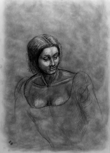
As the drawing progressed it became apparent that the kneadable putty rubber would be an important drawing instrument. The method forces the artist to work with highlights and then tone them down again once they are created. I found it a challenging approach. The result is quite striking as can be seen in the image below along with the silverpoint image it was based on. 

Silverpoint by da Vinci

My subtractive copy using graphite


Sunday, May 29, 2022

Painting and pencils


I have been preoccupied with the sale of our house and the purchase of a new one, which has more room for art studios and space for art materials. The new house is located in a small town in the country, there are forests and mountains withing a few hundred metres of the front door, so lots of inspirational sources on the doorstep.

The burning World

I developed a watercolour from the earlier pencil drawing of the topic. This is an A3 size painting rendered with W&N Cotman watercolours. 


Keeping my eye in

After completing the watercolour, the distraction of moving has prevented me from undertaking any new projects. I have spent some time drawing on A4 scrap paper. Inspired by some images of motorbikes I saw on DeviantArt, I tried my hand at something. I tried drawing a bike and rider using a small plastic kit I have. A week later I had another 'go' without any reference material to 'prop me up'. The profile drawing below is the result. 


The technology of motorbikes is not an area I am familiar with so perhaps a better result would have been forthcoming with a posed model or photograph. However, my aim is to create not copy, so this was intended as a start. 

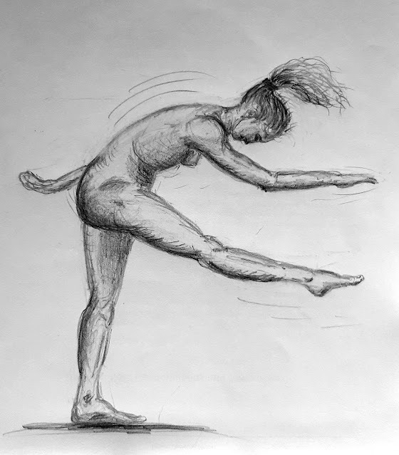
A week later I did a few more drawings of human heads, again with no reference material. Then, tired of packing stuff in boxes for the move, I took time out to try a figure drawing to see if the teaching of Paul Birchall had sunk in or evaporated. I think the image below indicates something has sunk in, though there is room for improvement - always :-) 

The idea of this sketch was to check my ability to draw a figure. I also wanted to create something dynamic and try to indicate movement, a point in time. Here the dancer has just completed a move, throwing her body and head forwards whilst raising her right leg, perhaps in preparation for the next move......
I was reading an article in imagineFX by Keith Gurney on the topic of composition. Keith suggests that the starting point of a drawing or image is the idea you are trying to communicate, one then works from that central idea outwards to create the image and its context. In this example I am still mucking about with anatomy issues, once they are resolved perhaps I can do more with this image or its descendants.


Wednesday, March 16, 2022

Boiling World


After learning to draw figures out of my head under the tuition of Paul Birchall, I decided to make use of my new found skill and create a drawing that involved figures.

The topic of Global Warming is current and so it seemed a good idea to put my drawing skill to use highlighting the problem through some form of allegory.

The Drawing

I decided to depict the planet steaming, with the fires of industry below adding heat. The inhabitants fall off as their ‘habitats’ become untenable.

In the clouds over the World the deities look on with sadness whilst Gaia raises her arms in despair.

In the background on the left another tree falls to the demands of the modern world, and on the right the ‘tree hugger’ vainly tries to protect something of the natural world.

The foreground is occupied by us, that’s you and me! On the left are those who are enjoying life, singing, dancing, and socialising. To their right and advancing on the viewer are the great disaffected, all protesting about something, usually couched in terms of I/WE WANT with no thought for the costs their demands imply.

At the head of the advancing crowd is their leader/politician, soliciting votes and support, whilst ‘kicking the can down the road’!

And naturally it will all end in tears. That dark shadow in the foreground is the cliff that humanity is marching towards!

Some thoughts

This is a continuation of my ‘postcards’ experience that Paul Birchall took us through in a UCT Summer School a few years ago. On this occasion it came straight out of my head.

It’s a bit of a pessimistic view of the state of the natural world, and it places the blame squarely on the shoulders of humanity.

In fact for most of the past 600 million years the world has been considerably warmer than it is at the moment. The really scary thought is that Global warming might be a natural phenomenon; and nothing we can do will stop it. We humans cannot survive in the warm conditions that have at times prevailed!

My process

Creating this image took quite a long elapsed time; I worked on it for a few hours and then left it for weeks at a time. I almost ‘doodled’ some of it. I really found it a relaxing, unpressured experience. I would sit with a pencil and putty rubber, regard the image and decide what and where it needed attention. Over time it evolved.

Problems like how to indicate the politician was a politician occupied my mind for several days but then using placards kind of solved that one.

The two sad ladies looking on from above were inspired by drawings by Mucha. 

Materials

The drawing is on A3 60gsm paper rendered with Lyra pencils of various softness. 

Wednesday, November 3, 2021

HMS Imogen (D44) Destroyer at sea en route to Norway 1940

 This painting is set to become a sort of family heirloom! My dad graduated from the RN college at Dartmouth shortly before the second world war and went to sea in 1940 as a crew member of the I class destroyer HMS Imogen. It was his favourite ship and he often spoke of her and destroyers in general.

I came across a photograph published by the Imperial War Museum of the ship. The photograph was taken in 1940 from a troopship en route to Norway. I realized that my dad would have been on the ship at that time, and decided to make a painting out of the image. This proved more tricky than I first thought.

The voyage of the Imogen

The actual voyage of the Imogen was quite eventful. Apart from serving as one of the escorts for the Home Fleet, an aircraft carrier, and hunting German ships in various fijords.

In the latter part of 1939 Imogen had been in action against their traditional enemy, the U Boat. In company with their sister ship Ilex, they had sunk the U Boat U-42, and taken some of her crew prisoner in the process. They also rescued 239 French merchant seamen from lifeboats, they were survivors from two ships (Bretagne and Louisiane) torpedoed by U Boats in the area.

Imogen was accidentally rammed and sunk later in 1940 off the Scottish coast.

The painting (W&N Artisan on canvas board, 50 x 76 cm)

I started with a poor quality photograph of the ship at sea. Using it as a basic outline I created a drawing of the ship on A3 drawing paper.


This gave me an outline and the hints of various details but no clear resolution of what the features I could make out were. At this point I referred to a number of books (see references below) with period photographs and plans of the ship and other ships like her. In the end I built a small paper and card model of the ship to figure out what went where on the deck from the viewpoint of the original photograph.


With the model to clarify where and what items were visible from the viewers position I was able to develop a more complete and I hope accurate drawing of the ship


The oil painting started with an under-painting where I mapped in the ships outline and shapes with blocks of colour. The sea and sky were also indicated with suitable glazing.


I then painted in the waves, a seascape and sky. This was new territory for me and the first rendition was an attempt at creating a typical northern sky of low dull grey clouds. The result was an unattractive image as you can see below.


I subsequently started taking figure drawing lessons from Paul Birchall, a local artist. He provided me with his views on the painting and gave some suggestions for its improvement. He went so far as to provide a mock up of how he would deal with it. As he pointed out, it’s a painting not a precise record of the photograph. I cannot say the sky or sea was a precise anything, just my attempt at painting something I was not particularly familiar or comfortable with.

However, I took Paul's wisdom on board, followed his advice and completely reworked the sky in the painting. I also made some changes to the sea to create a better feel for depth of view between the viewer and the ship. The result is the final version of the painting below.

HMS Imogen (D44) at sea

References

These are the books I used to refine my understanding of what the ship looked like.

Brown, L (2009) British destroyers A-I and Tribal classes. Seaforth Publishing. ISBN9781848320239

Greentree, D and Campell, D (2018) British destroyers vs German destroyers, Narvik 1940. Osprey Publishing. ISBN9781472828583

Haarr, G H (2009) The German invasion of Norway, April 1940. Naval Institute Press. ISBN9781591143239

Haarr, G H (2010) The battle for Norway, April – June 1940. Seaforth Publishing. ISBN9781848320574

Haarr, G H (2013) The gathering storm. The naval war in Northern Europe, September 1939 – April 1940. Seaforth Publishing. ISBN9781848321403

Plevy, H (2006) Destroyer actions, September 1939 – June 1940. The History Press. ISBN9781862274639

Tuesday, October 26, 2021

South African Air Force Avro Shackleton

 Whilst spending time at home doing a daily drawing of the human form out of my head, my other art class once a week was spent working on an oil painting of the South African Air force Avro Shackleton.

The work is based on a photograph of the machine that I took several years ago at an air show here in Cape Town. I used the image to develop a drawing – tonal study – of the aircraft.

Avro Shackleton A3 pencil drawing

After figuring out the tonal range of the image, I repeated the exercise in watercolour. This created a lovely tranquil looking image of the aircraft.

Avro Shackleton A3 watercolour

Up to this point the image was not particularly adventurous, in fact it was little more than the recreation of a photograph in different media. Something that computer packages purport to be able to do these days! I wanted to go for something a little different in the oil painting.

My first idea was to place the aircraft over the sea with a drifting rubber dingy of small lifeboat in the water, thus depicting the aircraft in the air sea rescue role. I looked at some paintings of seascapes with small boats in them and found one by JMW Turner. I used some of its background to create a mock up of what a painting might look like.

Avro Shackleton rough with lifeboat - A4 watercolour

The mock presence of the boat created some issues with composition and perspective which was a distraction from the main point of the image, the aircraft. So I tried again without the boat and more defined storm clouds.

Avro Shackleton - A4 watercolour rough

Then I looked at one of Turners most iconic painting, the ‘Fighting Temeraire’, and in particular the sky behind it. I began to wonder how Turner would approach and paint this aircraft. Another rough watercolour followed. This proved more acceptable so I used it as the starting point of the painting and created the first glaze of the painting on the canvas board.

Avro Shackleton final watercolour and first oil glaze

As the painting developed the sky went through a number of iterations such as the one below. Here the suggestion of a horizon can be seen in part of the image.

Avro Shackleton Oil glaze - intermediate stage 

I decided to enhance the horizon suggestion without making it too explicit, the idea is to leave the background to the viewers imagination whilst the foreground (aircraft) is realistic and explicit.

Avro Shackleton Final oil painting - 20 inch x 30 inch

I hope you like the final result.